Why were Nextbike users paying fines for parking correctly?
Because the app had a location detection issue. It couldn't accurately tell if a bike was parked in a valid zone, so it wrongly assumed incorrect parking and fined users anyway. That was just one of five problems I found. I redesigned three of them, each tied to a business KPI.

Challenge
A cluttered map, no parking zone guidance, and a dead-end support flow were creating frustration, fines, and churn.
Approach
User research + Reddit + app store reviews → 5 pain points → prioritised 3 solutions using an impact/effort matrix.
Outcome
Three redesigned flows (Clean Map, Effortless Parking, Customer Chat), each targeting a specific business KPI.
01 · User research
Talking to real users to find the real problems
As a regular Nextbike user in Berlin, I already had first-hand experience of the friction. I spoke directly with other users and supplemented that with feedback from Reddit and app store reviews.
Research cohort
What users said
It's bad, as I always end up paying extra for incorrect parking even when I'm parking at a parking location.
It's hard to understand which bike is closer to me. Sometimes I reach a bike and find out that I can't rent it.
Research synthesis

Pain points gathered from conversations and online sources, grouped and prioritised by frequency.
02 · User pain points
5 friction points across the core journey
Research surfaced five distinct pain points. Each one represents a moment where the app removed control or clarity from the user at a critical step.
Difficulty locating nearby bikes
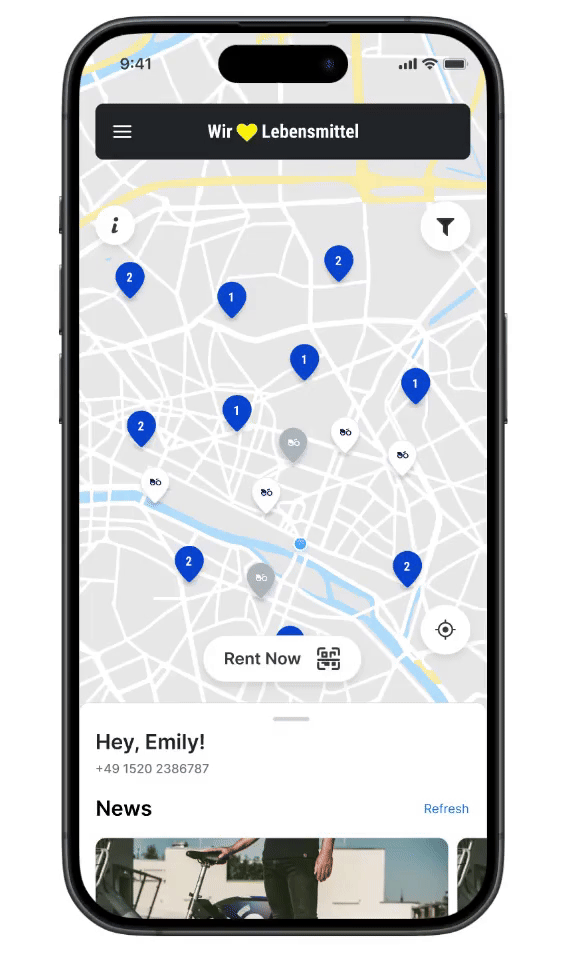
A cluttered map with identical markers made it hard to find available bikes quickly, leading to prolonged search times and app abandonment.
The interface should make options visible so users don't need to memorise or decode information. Every station looked identical, so users had to tap each marker individually to understand availability, putting the cognitive work on them rather than the UI.
Fixed by: Clean MapDensity-based display means availability is readable at a glance, with no tapping or memorisation needed.
Limited control over the map view
No filtering options meant users couldn’t narrow results to nearby bikes or show only parking stations, making the map harder to use as familiarity grew.
Systems should allow experienced users to tailor interactions. A regular commuter who only cares about stations within 300m gets the same cluttered, unfiltered view as a first-time user, with no way to shortcut to what they actually need.
Status: identified, not yet addressedDeprioritised using the impact/effort matrix. Addressing map clutter first (Clean Map) reduces the underlying noise; filters are the logical next iteration.
Missing information on past trips
Past trip maps weren’t interactive, making it hard to revisit start and end locations. Key data like distance travelled was absent from trip details entirely.
The system should always keep users informed about what is going on. After a completed trip, the app surfaces almost nothing: no route, no distance, no interactive map. Users are left without meaningful feedback about what actually happened.
Status: identified, not yet addressedDeprioritised in this sprint. Improving post-trip visibility is a clear next step once the higher-impact flows are shipped and validated.
No guidance on correct parking
The app had a delay in detecting bike location accurately. This caused it to wrongly assume incorrect parking, fining users even when they had parked at a valid designated zone.
Good design prevents problems before they happen. The app had a location detection delay that caused it to misidentify valid parking as incorrect, charging users a fine they had no way to anticipate or avoid.
Fixed by: Effortless ParkingA visual parking indicator gives users real-time confirmation that the app has recognised their location as a valid zone before they end the trip, reducing the risk of a misdetection going unnoticed.
No in-app communication after raising an issue
Support only allowed submitting a new issue and it didn’t show existing ones. All follow-up happened via phone or email, completely outside the app.
Users shouldn't have to wonder whether different actions follow different conventions. An issue raised inside the app should be resolvable inside the app, yet every follow-up was pushed to phone or email, breaking the expected interaction pattern entirely.
Fixed by: Customer ChatThe full support loop (viewing issues, messaging the team, tracking status) now lives inside the app, consistent with where the issue was originally raised.
“The same problem at every step: users were left guessing.”
Where are the bikes? Am I parking correctly? Did my support issue go anywhere? Each pain point was a moment where the app removed control rather than giving it. The redesign focused on the three areas with the clearest KPI impact, using an impact/effort matrix to prioritise.
04 · Solutions
Three redesigned flows, each tied to a KPI
Each solution directly addresses one or more pain points and maps to a measurable business outcome. Expand “Design rationale” on any card to see the thinking behind each decision.
Clean Map: show fewer bikes, find one faster
When zooming out, the map stays clean and uncluttered, showing only a limited number of bikes and stations. This makes it easy to quickly identify available options without being overwhelmed by every marker on the map.
The core challenge was deciding at what zoom level to reveal individual bikes versus clusters. Showing everything at once (the current behaviour) means a user looking for the nearest option has to mentally filter dozens of markers before they can act.
The redesign uses a density-based visibility threshold: at city-level zoom, only high-availability stations appear. At neighbourhood zoom, all stations are visible. At street level, individual bike markers appear. This mirrors the natural intent progression: “which area?” → “which station?” → “which bike?”
Effortless Parking: know you're in the right zone before you stop
Now park the bike conveniently at a parking location by checking the parking sign displayed on the trip details page. Users can confirm they're within a designated zone before ending the trip, preventing the wrongful parking fees that were eroding trust.
The key decision was whether to show the parking indicator only at the moment of ending the trip, or continuously during the ride. Showing it only at the end risks users being in the wrong location with no easy way to correct course.
The indicator is shown throughout the active trip, updating as the user moves, so they can navigate toward a valid zone naturally rather than scrambling at the last second. It uses the universally recognised blue parking sign (P) with a clear in-zone / out-of-zone state to avoid any ambiguity.

Customer Chat: bring support communication inside the app
Customer support issues can now be easily seen and communicated through the mobile app. All existing issues are visible, and users can chat directly with the support team, without being redirected to a phone call or email.
The main decision was whether to build full real-time chat or an async threaded system. A live chat implies instant responses, which could set unmet expectations if agents aren't always available.
The solution uses an async messaging thread, similar to a support ticket with a conversation attached. This sets the right expectation while being far faster than phone or email. Status indicators (open / in progress / resolved) give users confidence their issue is being handled without needing to chase.

See all three flows in action
The full interactive Figma prototype covers Clean Map, Effortless Parking, and Customer Chat.
Open Figma prototype05 · Validation
Did the redesign actually help?
I brought the same 6 people from the research group back to test the redesigned prototype, including Marianna and Ali. Given the small sample, the CSAT score is a directional signal, not a conclusive metric. But it points in the right direction.
Method
Usability testing
Each participant completed the same core tasks on both the original app and the redesigned prototype. After each session I collected a 5-point CSAT score alongside brief open-ended feedback on clarity and confidence.
CSAT: before vs after
+12.5% improvement. Directional signal only. Sample size of 6 is too small to be statistically significant.
What participants said
Every participant rated the redesign higher than the original. Qualitative feedback consistently pointed to clearer map readability, more confidence around parking, and feeling less abandoned after raising a support issue.
Limitations: n=6 is appropriate for qualitative insight but not for statistical confidence. Participants knew they were being tested, which likely reduced real-world urgency. Task completion time was observed but not formally measured.
What I'd test next: A larger cohort (15–20) with outdoor testing conditions, task completion time as a primary metric alongside CSAT, and a specific focus on whether the parking indicator reduces fine-related complaints in practice.
06 · Learnings
What this project taught me
Three things I'd take directly into a real product team. This was a personal project with no affiliation with Nextbike. I approached it as if I were a new member of their design team with limited sprint time.
Consistency beats perfection
Working within Nextbike's existing system (components, typography, hierarchy) kept the redesign realistic to ship and familiar to users. Imperfect system, right call.
Design becomes convincing when it connects to outcomes
Collecting CSAT scores from real people made the KPI framing concrete. "Users preferred this" is a far stronger argument than "I felt this was better."
Choosing what not to solve is part of the design
I identified 5 pain points and solved 3 deliberately. Map filtering and trip history are real problems, but the 80/20 logic said tackle higher-impact flows first.